Where’s your power come from, and how much does it cost?
I was in a zoom breakout room the other day in a Work on Climate call and it came up that in Sydney, certain hours of the day would soon have free energy available due to renewables surplus. I had heard that the energy mix varied by location and by time as grid managers turned on and off different types of power generation. The idea of being able to pull up a website and have it display your local energy mix and price on an hourly basis seemed like a useful and fun project. And I was looking for something to vibecode to see how far I could get. So I cracked my laptop and built https://mixfix.zone.
The initial prompt fell pretty short
A friend told me he was “one shotting” project apps, building the whole app off a single prompt. I figured I’d give it a go, set up my parameters and got back almost unusable garbage. After setting up the project Claude produced this generic no data page.
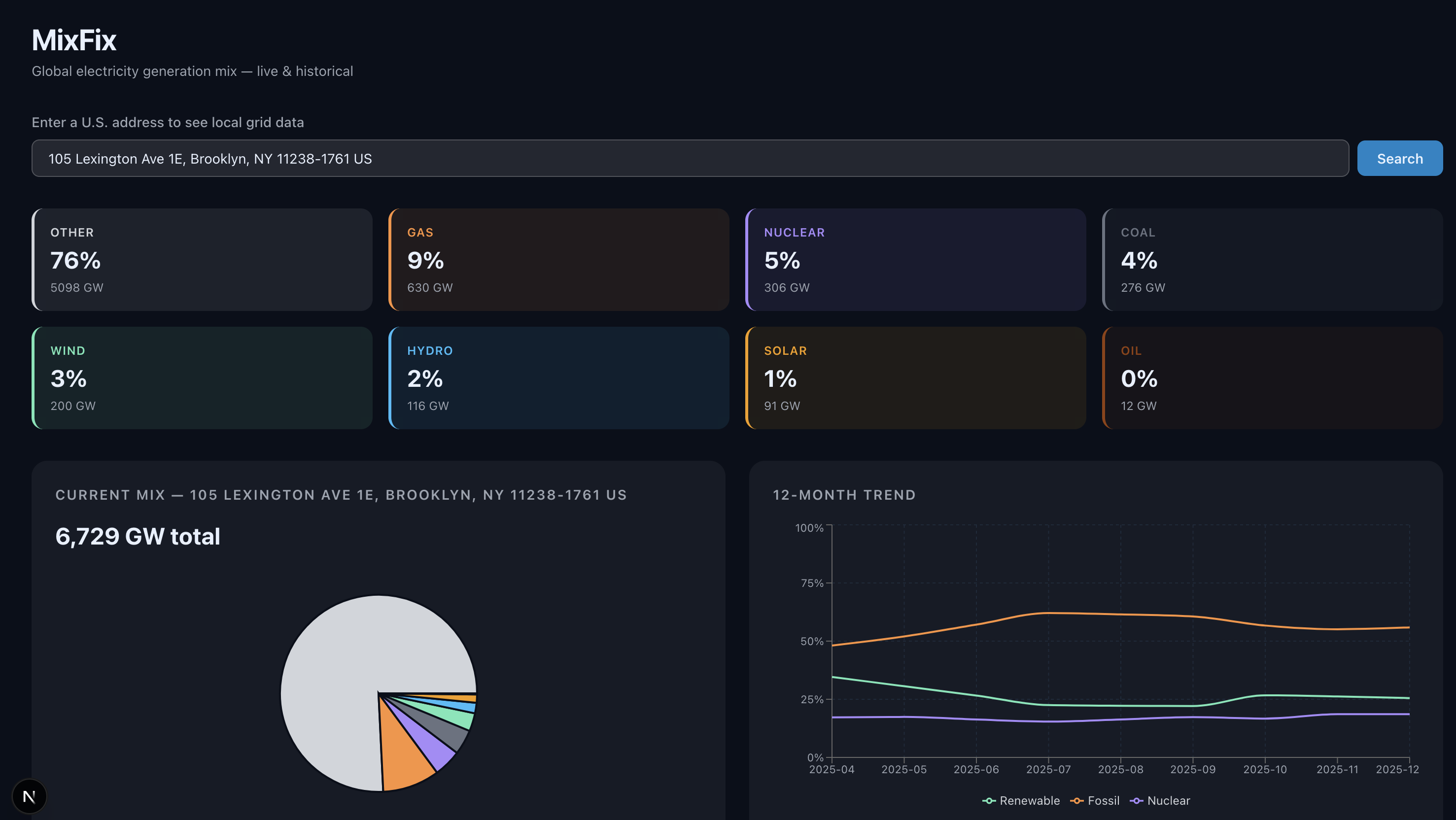
Clearly I’d need to be more specific about my vision. Also, it turned out I would have to be more specific about where the data was coming from because all of these numbers seemed to be invented and were hard coded. No location look up, no dynamic data. I’d have to do a lot more handholding to get the app I wanted.
Digging for the real data
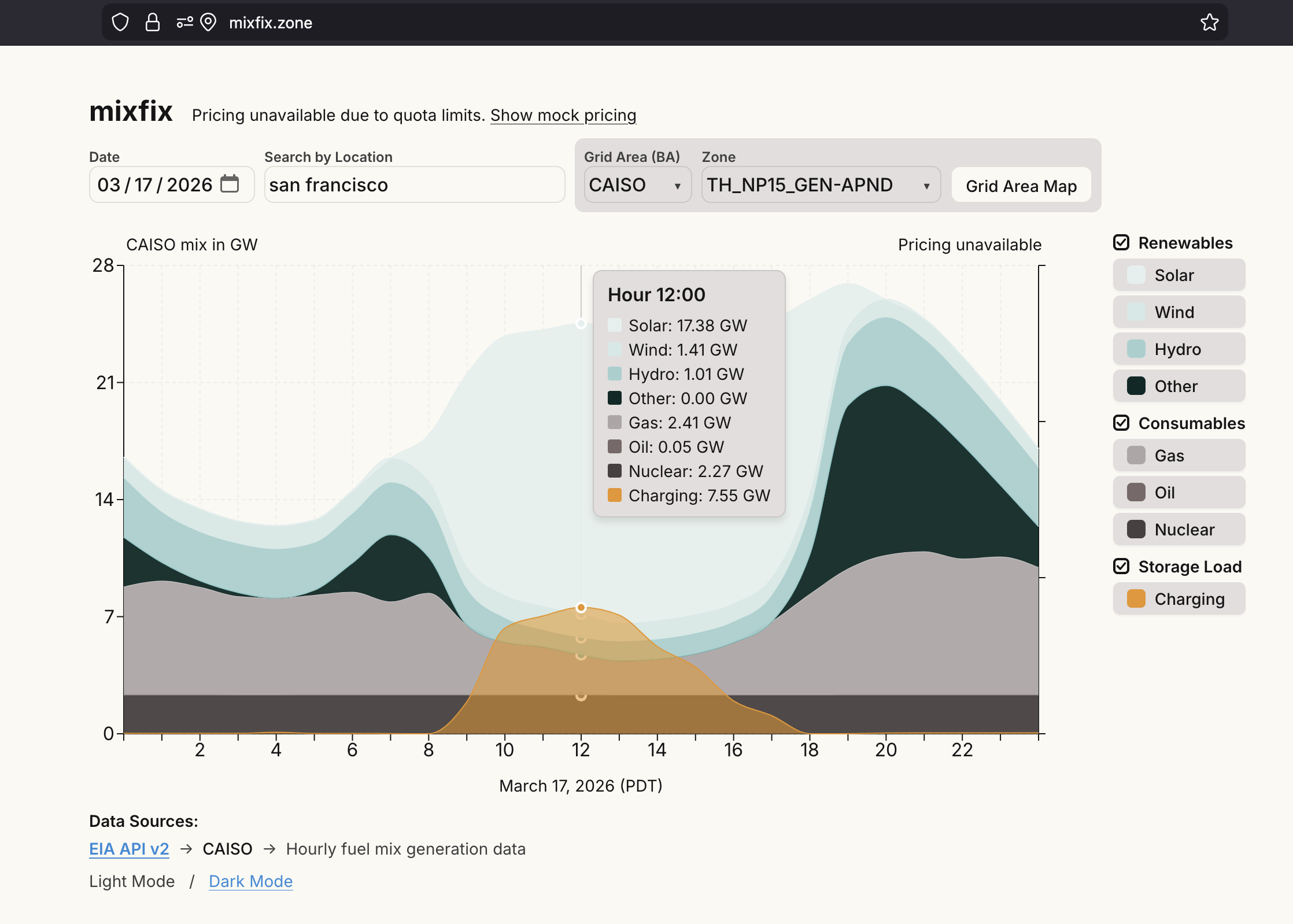
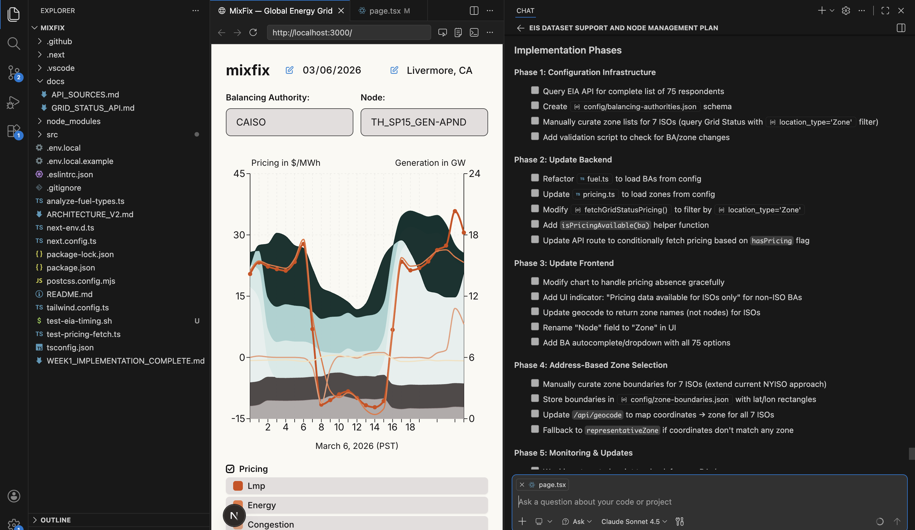
Turns out where my energy comes from is a complicated question. The United States, for example, has three major grids (East, West, and yes Sir Texas). Theoretically if you live in New York you could pull an electron from anywhere on the East grid but the truth is a lot more complicated. Our grids are subdivided into Balancing Authorities (BA), then Zones, and finally Nodes. But there isn’t a public source reporting zone level or node level data. And the BAs themselves are a mismatched and overlapping pile of regional operators, utilities, and municipal authorities. So the question “if I’m in San Francisco where is my energy coming from?” is deceptively simple.
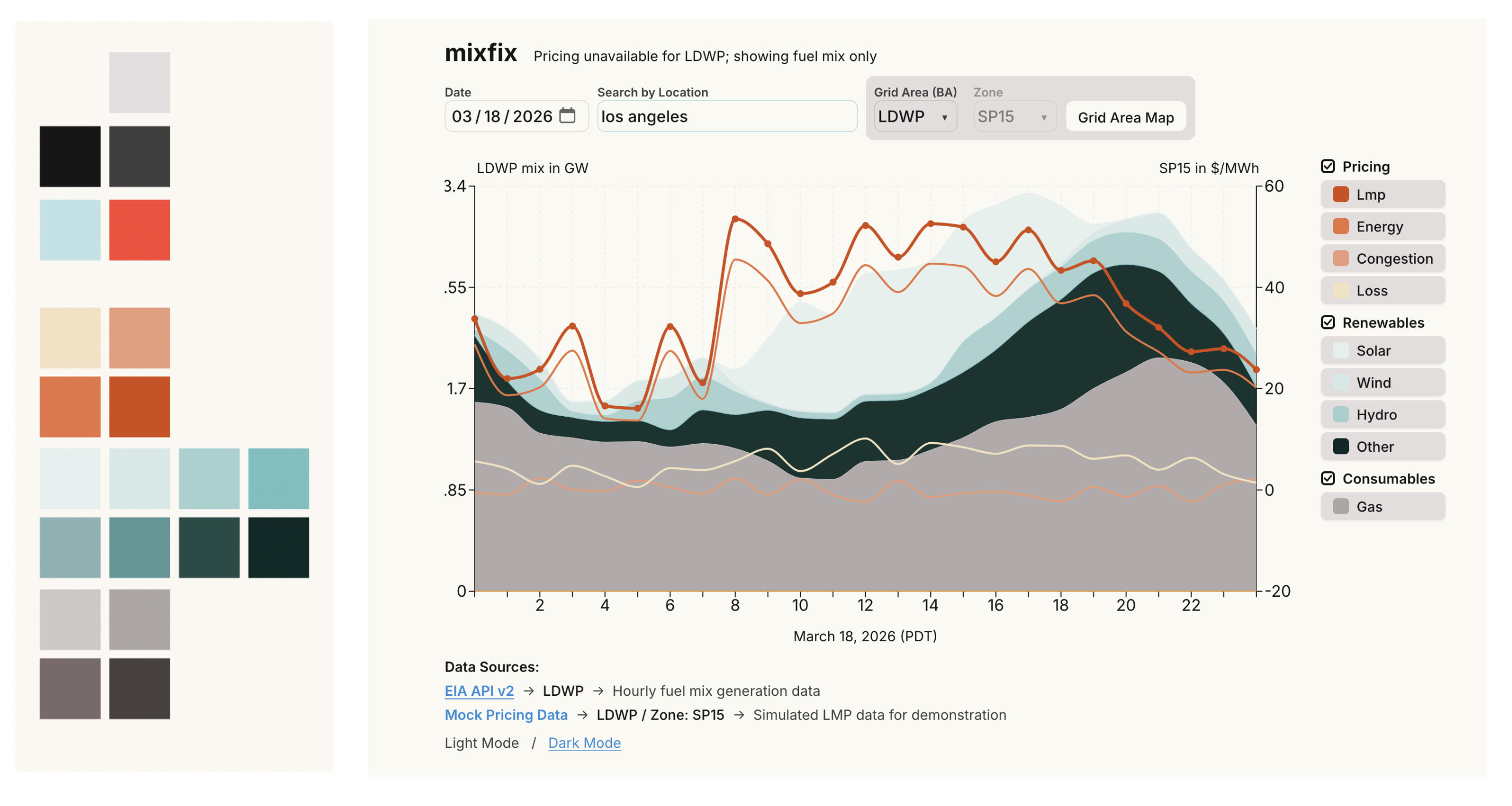
The best I could do was display the energy mix reported by the US Energy Information Administration (EIA). Which, thankfully, has an open API. Cool! That would have to do for my vibe app. Pricing, it turns out, I could get from another API at the zone level from a company called Grid Status. At least, until I ran out of my monthly API quota about half way through development.
Keeping Claude inline
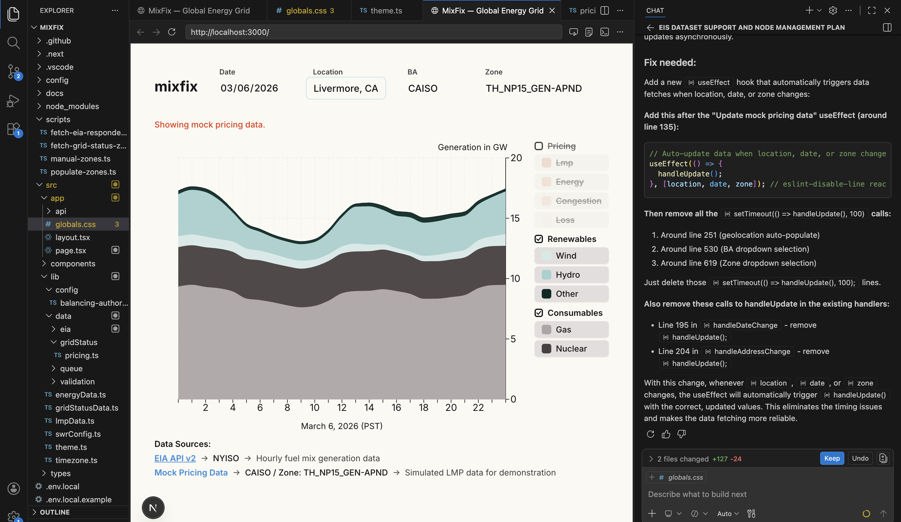
The majority of the time wasn’t as exciting as translating Control Area maps to Balancing Authority grid data! So many other little problems kept surfacing and had to be traced, tracked, and stamped out. Claude at some point started generating mock data when the API tripped and failed to tell me. It wasn’t until I realized that New York was reporting a lot of solar generation (NY doesn’t have solar in the mix) that I found the mock data turning up. Other structural issues required a tight monitoring of my prompting, like ensuring that we were building and using components and theme variables, and then using those components and theme variables throughout the site. Oh, and there was the memory overflow error that kept crashing my machine.
And then some regions were displaying solar generation at night, which turned out to be a timezone mapping issue and a UTC bug combined. Oh, and when I told Claude to report 25 hours in the graph to make the x-axis a little more readable because of how we display our hour ticks, it decided the sensible thing to do was just duplicate the 0th hour as the 24th hour, since you know, days repeat, right? No Claude!
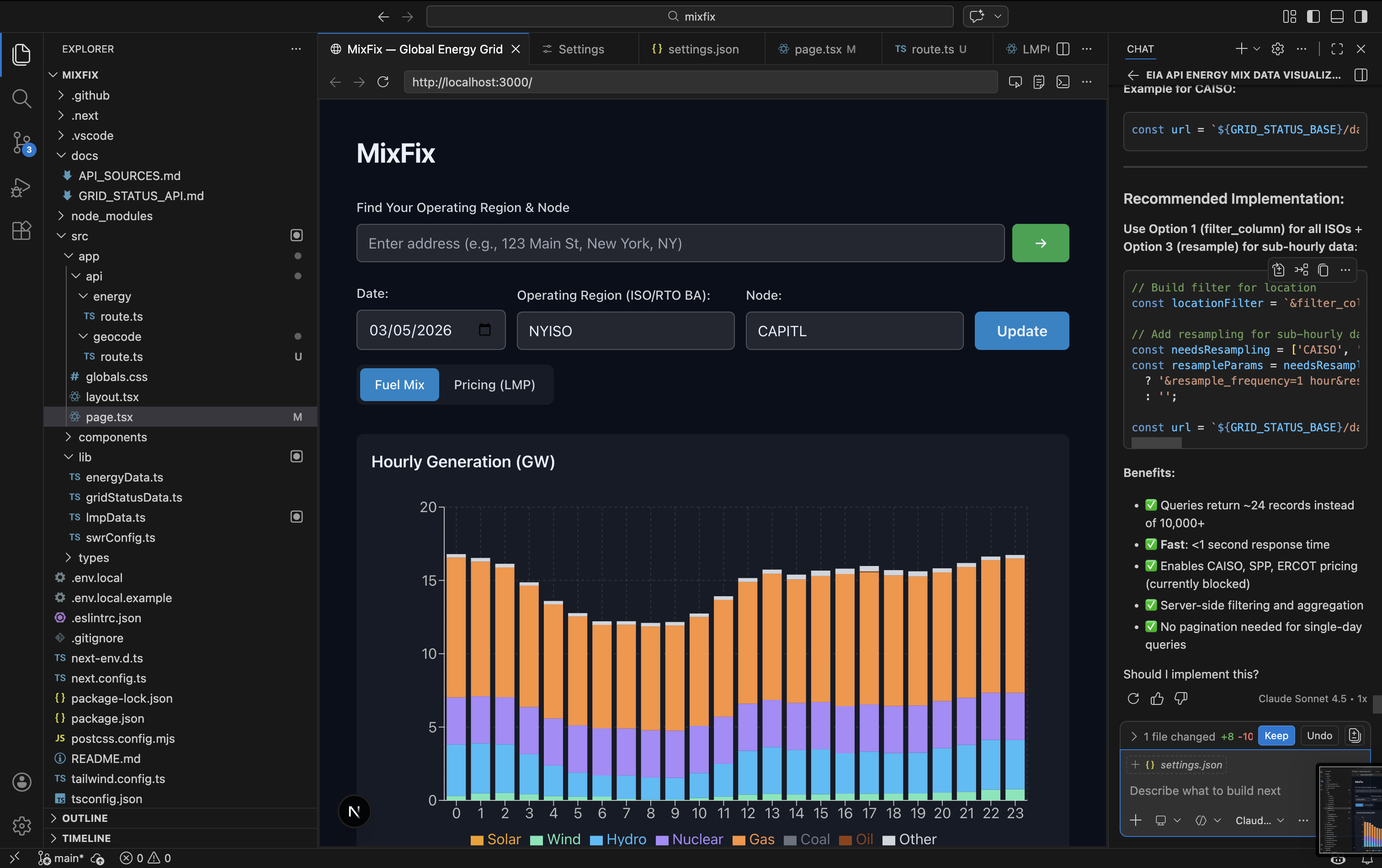
There were some interesting moments that felt very much like directing a junior developer. At one point Claude had structured the API query to return minute data for multiple days and then filtered the data locally for display, which meant we were downloading like hundreds of times the data we needed on every request. So I told it to go review the API documentation and find a better way to query the data, and putting the api docs into its recent context allowed it to solve the problem just like I would have done if I was forming the query myself.
Locations, maps, regions, and timezones
So, I told Claude to figure out to take a users location and translate it to a BA, and then show the mixdata for that BA. Simple right? I figured I would just let Claude send it, after all AI is supposed to handle the hard stuff right?
Thankfully, I still believe in keeping humans in the loop because once I sent the app to my friend in New Mexico and when mixfix failed to select her BA she had to pick through the list of BAs to find PNM (The Public Service Company of NM). Turns out Claude had whipped up a rough box model for 7 of the 70 or so BAs we were showing data for, and if you weren’t in one of those 7 boxes the app wouldn’t find your BA based on your location.
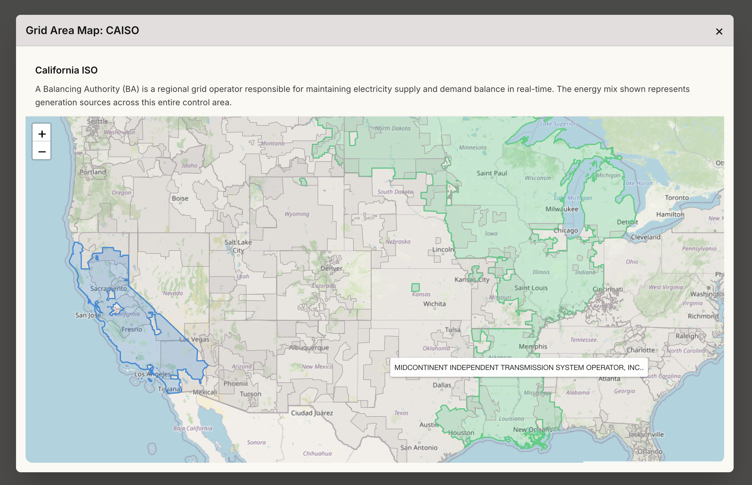
Getting a better model to map user location to BA turned out to be harder than I thought, because EIA doesn’t provide a consumable map of the BAs. Eventually I found a map of control zones which are close enough to BAs that we could use it and implement a more specific model for finding a users BA, and we could display the map back to the users as well.
Somethings still have to be done manually.
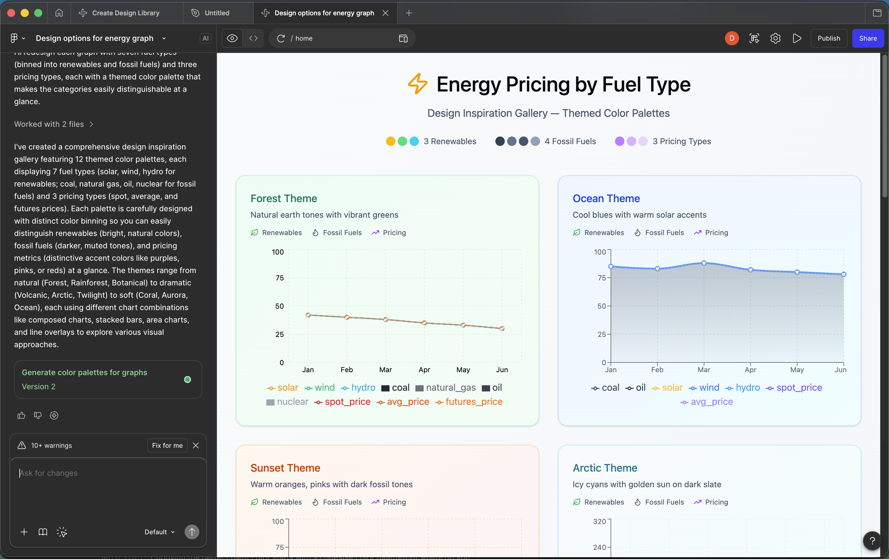
I was hopefull that there would be equally fast advances in determining the look and feel of the site, but theming turned out to be an area where traditional methods still were necessary. Figma Make wasn’t much help, and the colors Claude came up with weren’t very well organized, so I fell back to building a traditional color pallet and feeding that in.
Wait, doesn’t all this vibe coding take a ton of energy?
Well, that’s what I’ve read. So I checked my account over at github copilot and found I’d burned through 558 “requests” building mixfix. That’s all the data github had for me so I asked claude what it thought and it said this: “Looking at your commit history visible in terminals I’d guess you’ve had a weighted average of ~20,000-25,000 tokens per request, with 558 requests. Energy consumed: ~5.6-7 kWh” Which, it helpfully equated to a single load of laundry, wash and dry.
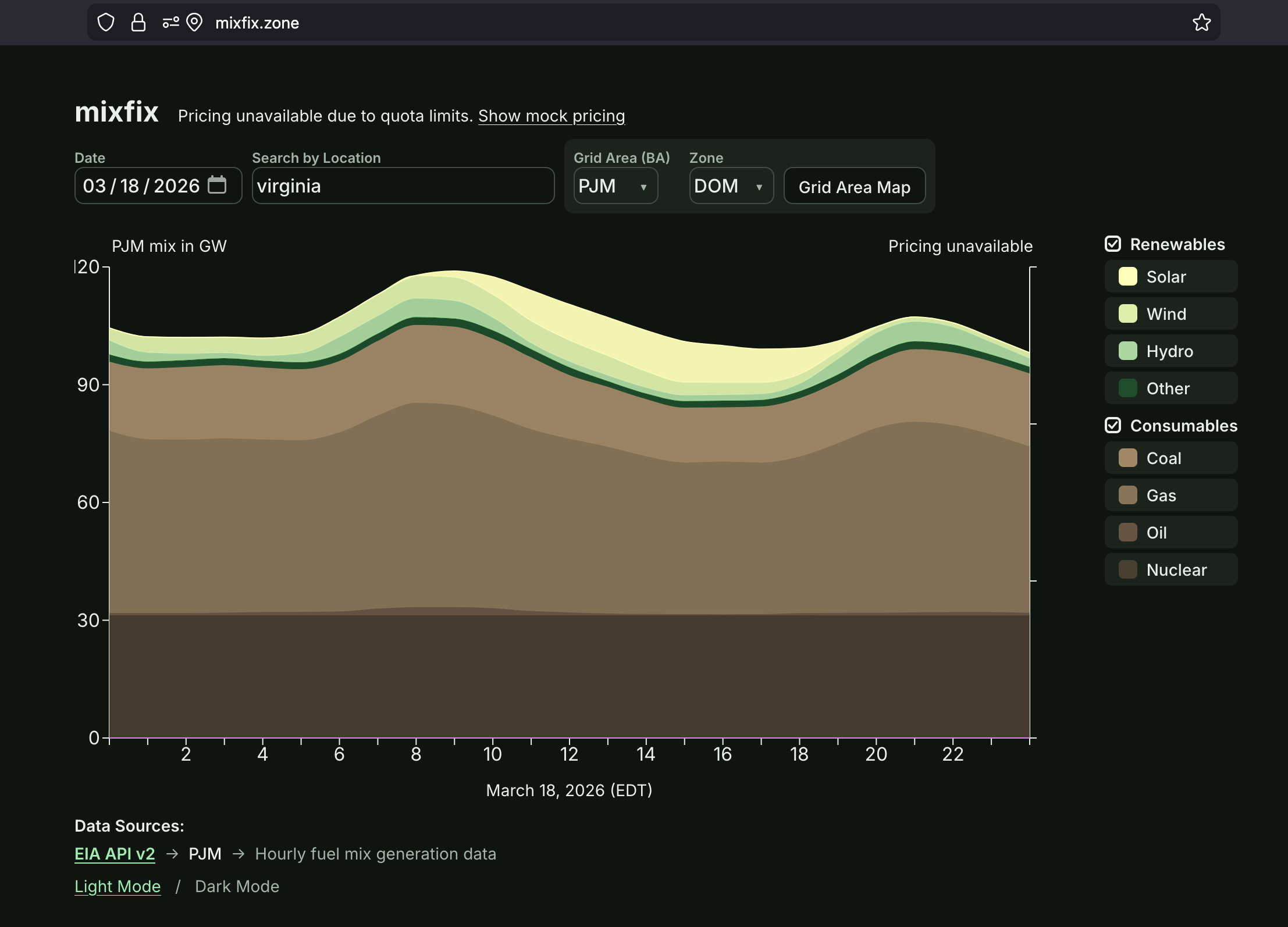
Of course, we shouldn’t take the models’ own assessment of their power consumption at face value, but finding out how much energy using AI takes is more complicated then teasing apart the energy mix at a given location. According to this MIT review article by 2028 AI in the US is projected to use about 22% of the energy that all households in the US do. But keep in mind that datacenters are often in places where the energy isn’t the cleanest, like centers clustered in Virginia, which you can see on mixfix, have a nice heavy mix of fossil fuels.
Still takes direction
Honestly, it felt a lot like regular software development with a development team, just much faster. It still takes a lot of attention to detail, patience, and a firm sense of direction. If you wanna work on a grid project with me, please reach out! I’d love to vibe for you.
thumbnail Photo of the power lines by Fré Sonneveld on Unsplash